The burger menu opens Fullscreen Overlay navigation with image background.
Dedicated Blog - Examples and demos
These are just some examples of what's possible with the Dedicated Blog template. Remember, elements of this template such as headers and footers can be selected independently, so you can mix and match to create your perfect layout.
Wedding Photography Blog
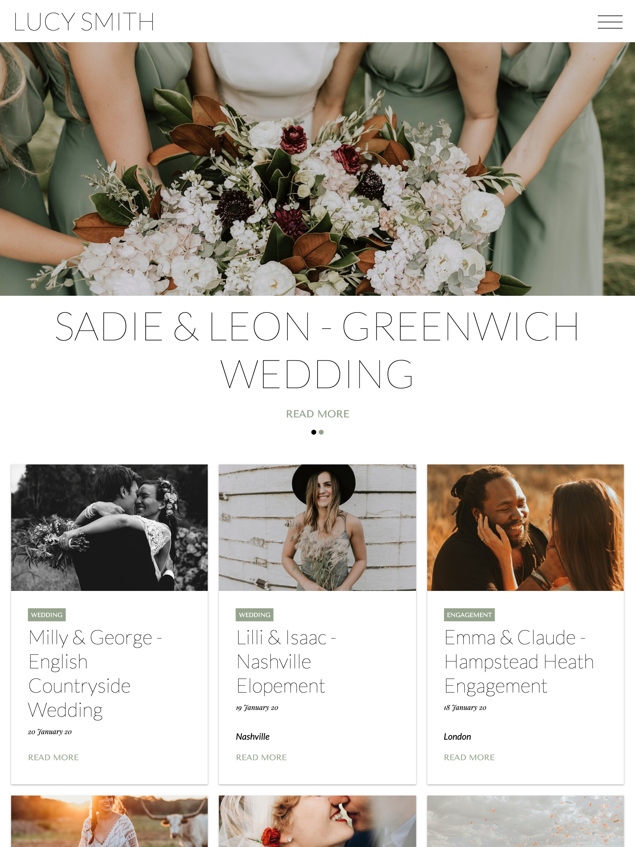
Index view using Card layout, with featured posts carousel highlighting key content.
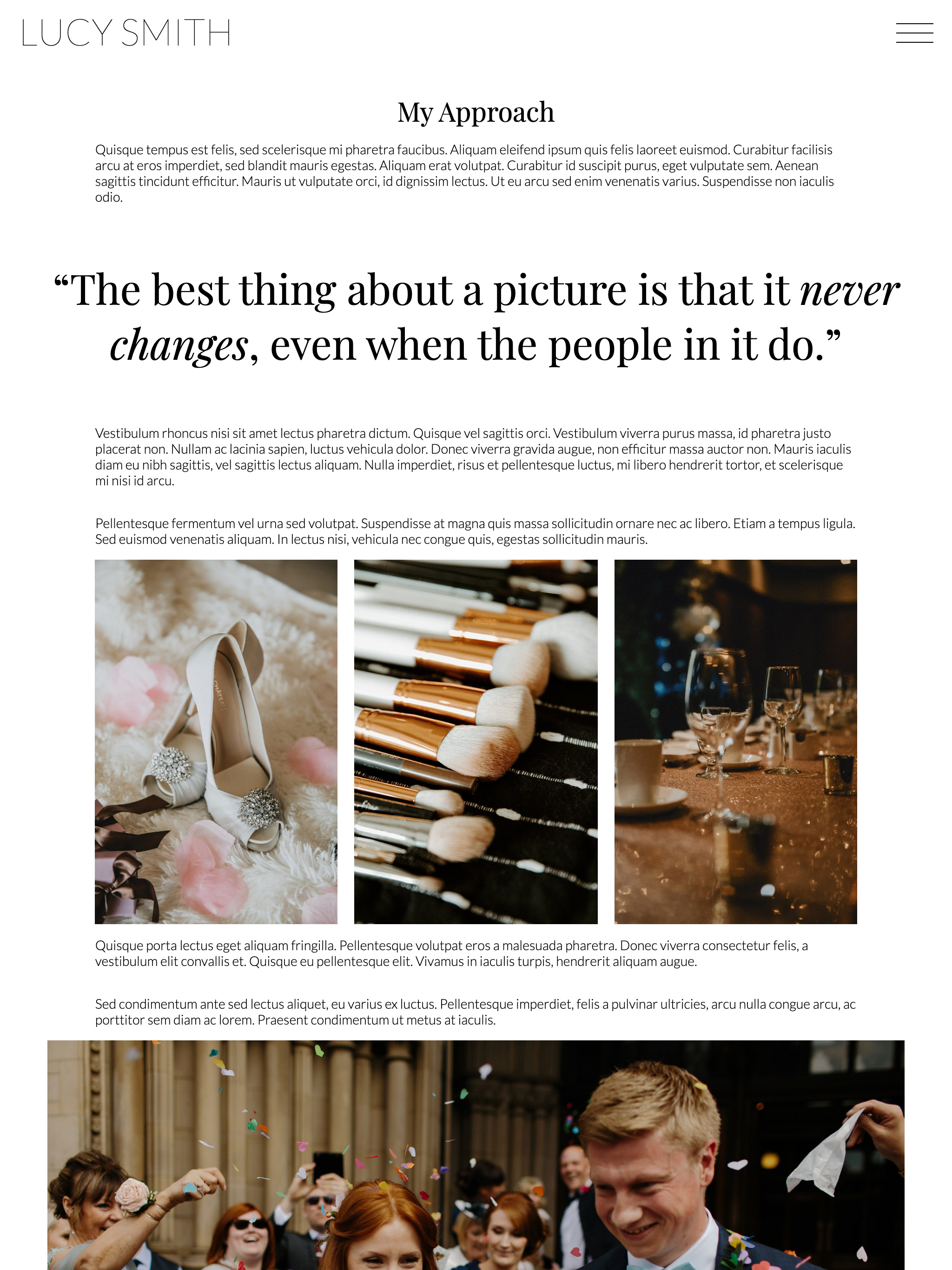
The Freeform Text & Media page makes an engaging way to tell your story, with varied post templates to layout images and text.
Fashion Photography Blog
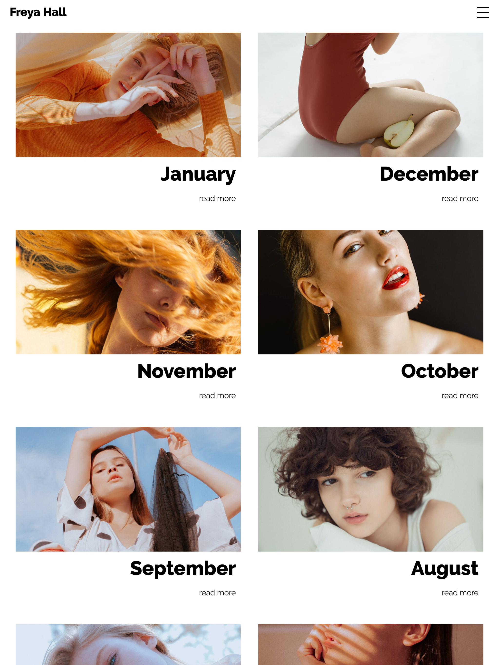
Duo layout, showing minimal post information on the index view to make images the focal point.
Text pages can include a video instead of images. The Split layout of the Text & Media page is perfect for a short video.
Photography Blog
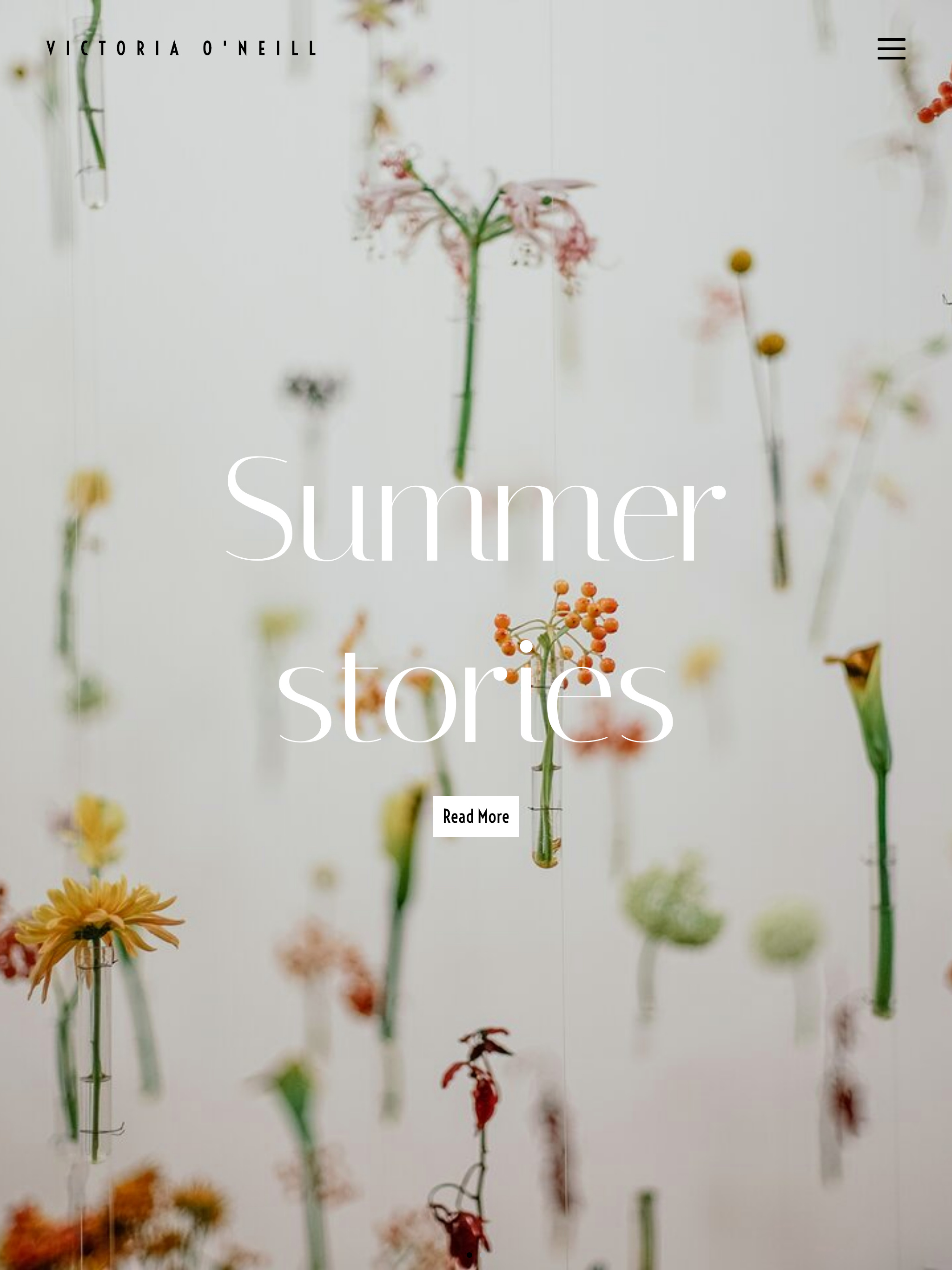
Index view with Banner layout and large featured post brings the wow factor.
Photo diary
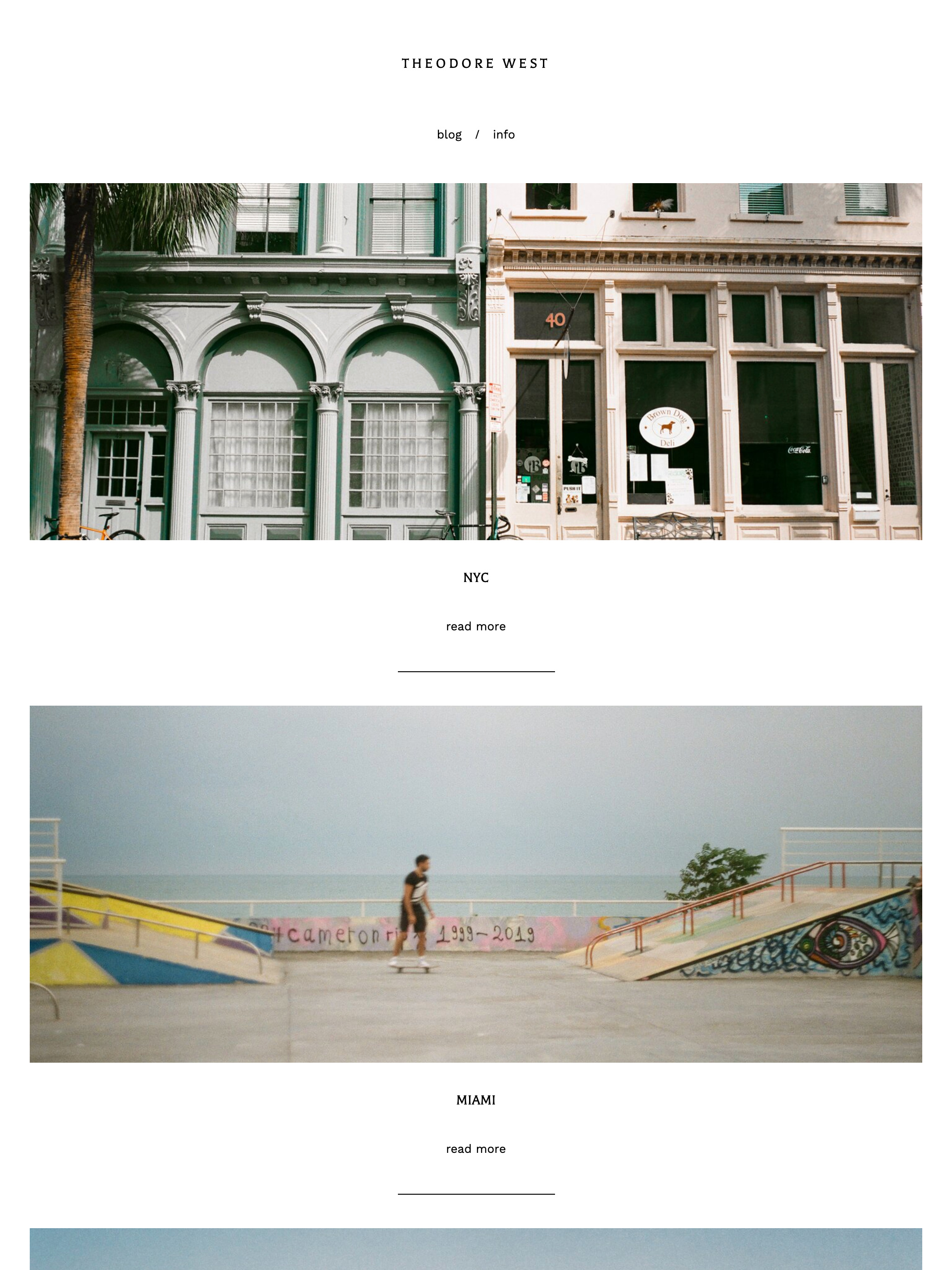
Wide index layout with Simple Top Bar header is perfect for a polished and minimalist photo diary or travel blog.
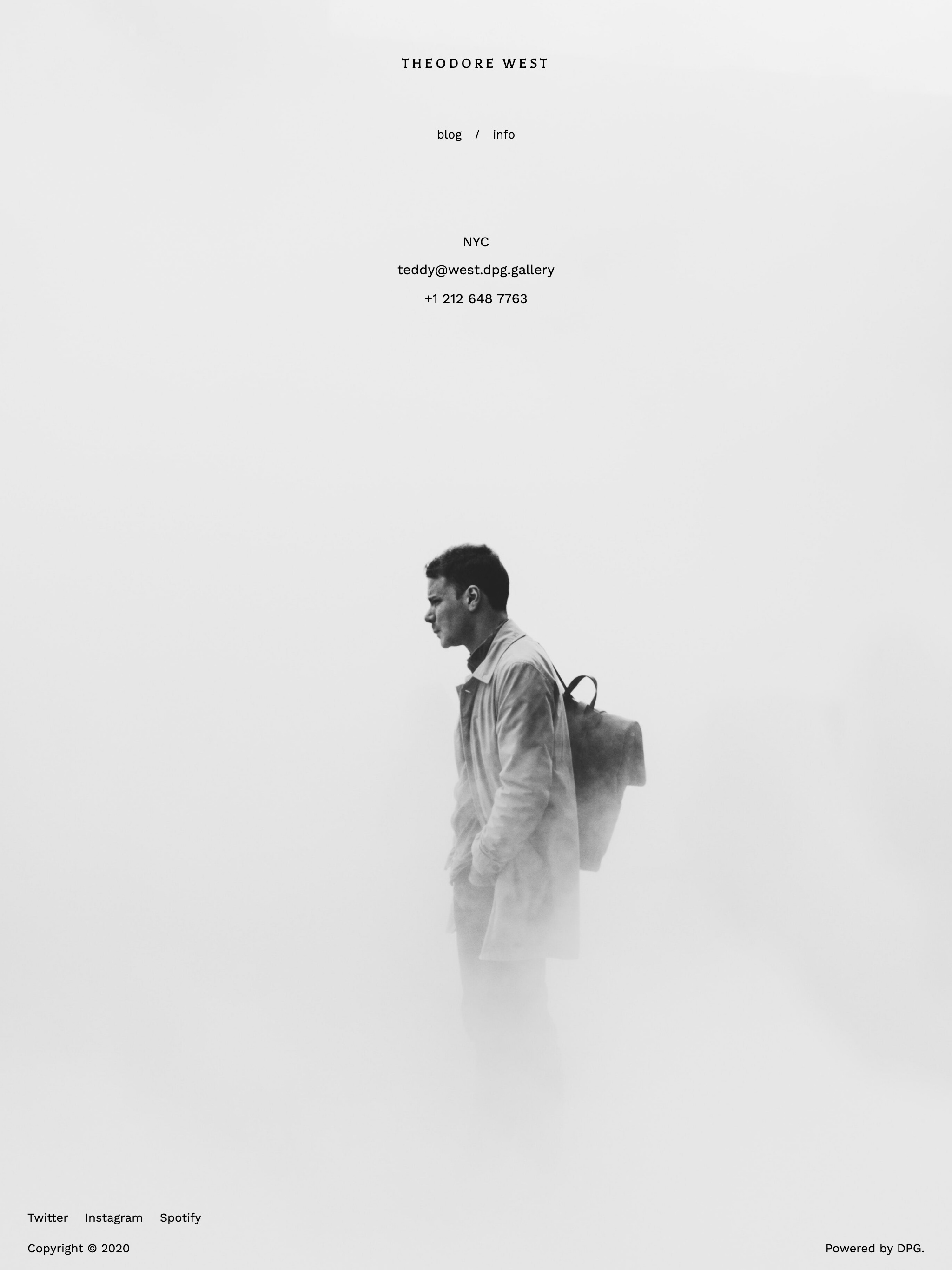
The Text & Media page features a full-page image background.
Photography Blog
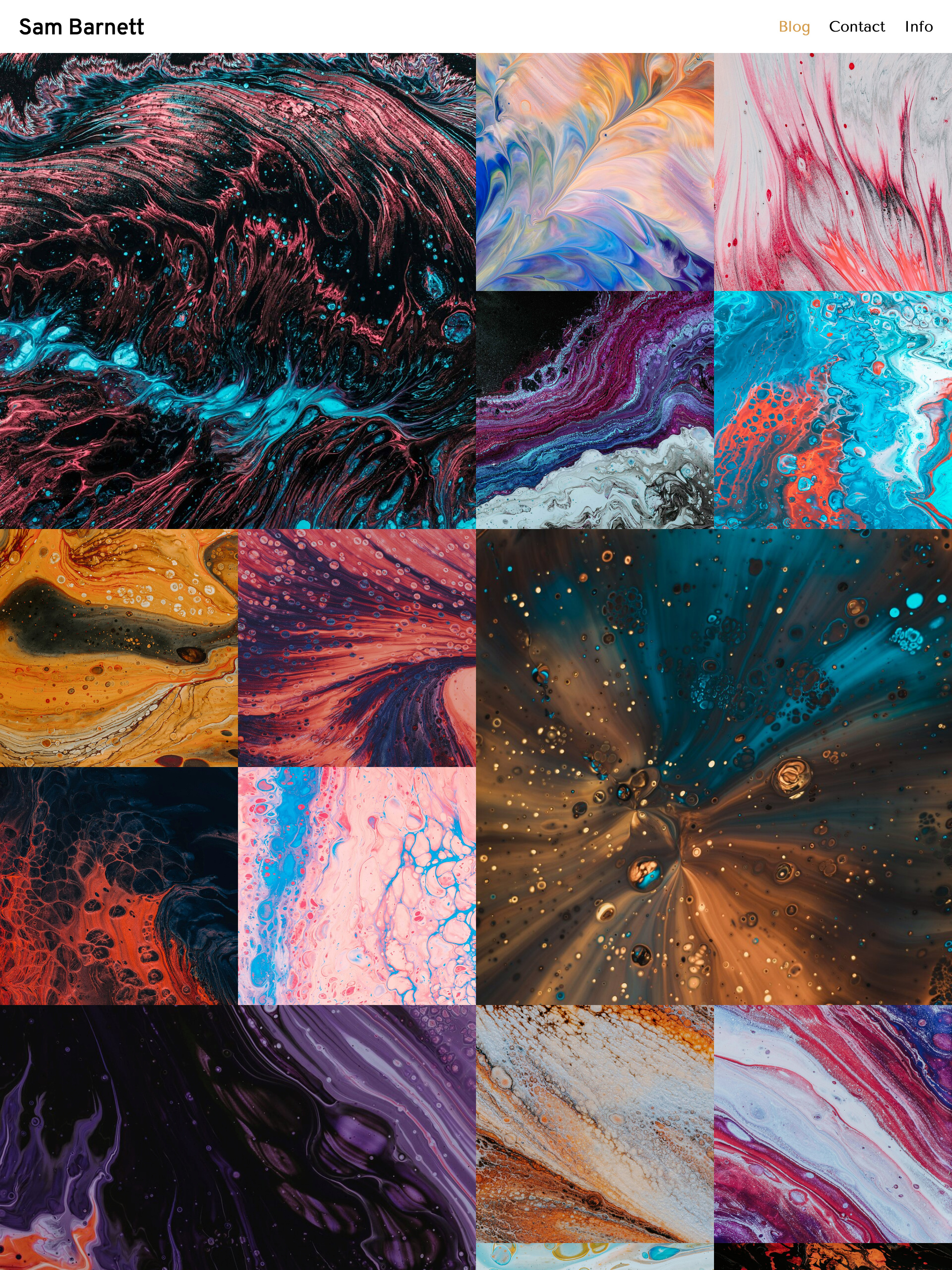
Grid layout makes for a super dynamic index view, all about the images.
Split Top Bar navigation gets smaller on scroll to provide focus on the all-important content.
Dark Mode enabled theme allows visitors to control their browsing experience. Try switching to Dark Mode on your device anywhere on this site to see the theme change from light to dark colours.
Lifestyle Blog
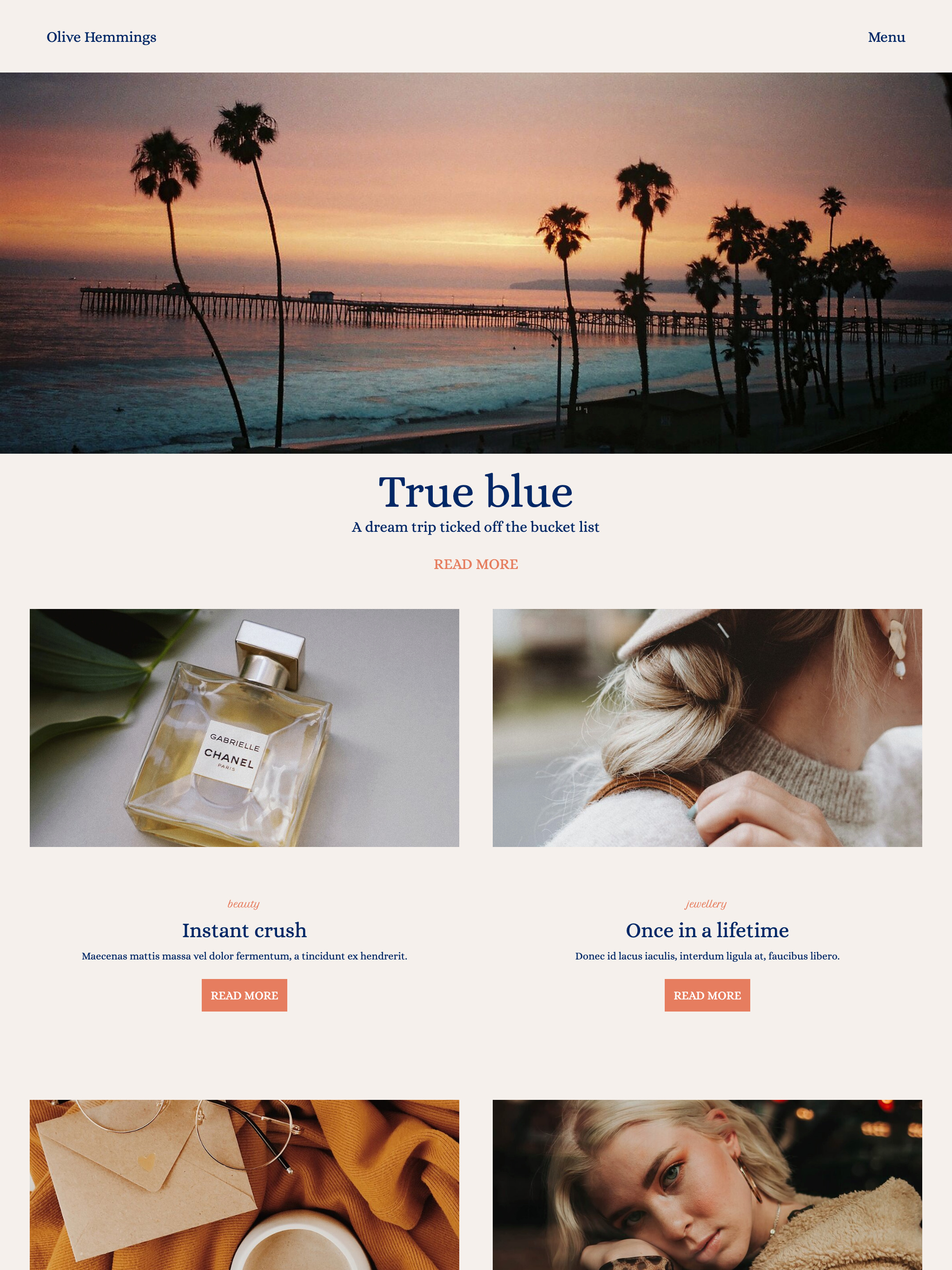
Duo index layout gives a great overview of what the blog is about at a quick glance. Use blog subtitles to provide more context and encourage visitors to delve deeper.
The Sidebar Overlay Menu and Nested Navigation are elegant ways to handle larger numbers of navigation items, keeping them organised and out of the way when not needed.
The Bespoke layout of the Text & Media page gives you precise control over text areas, allowing you to create overlap compositions such as this striking About page.
Photography Blog
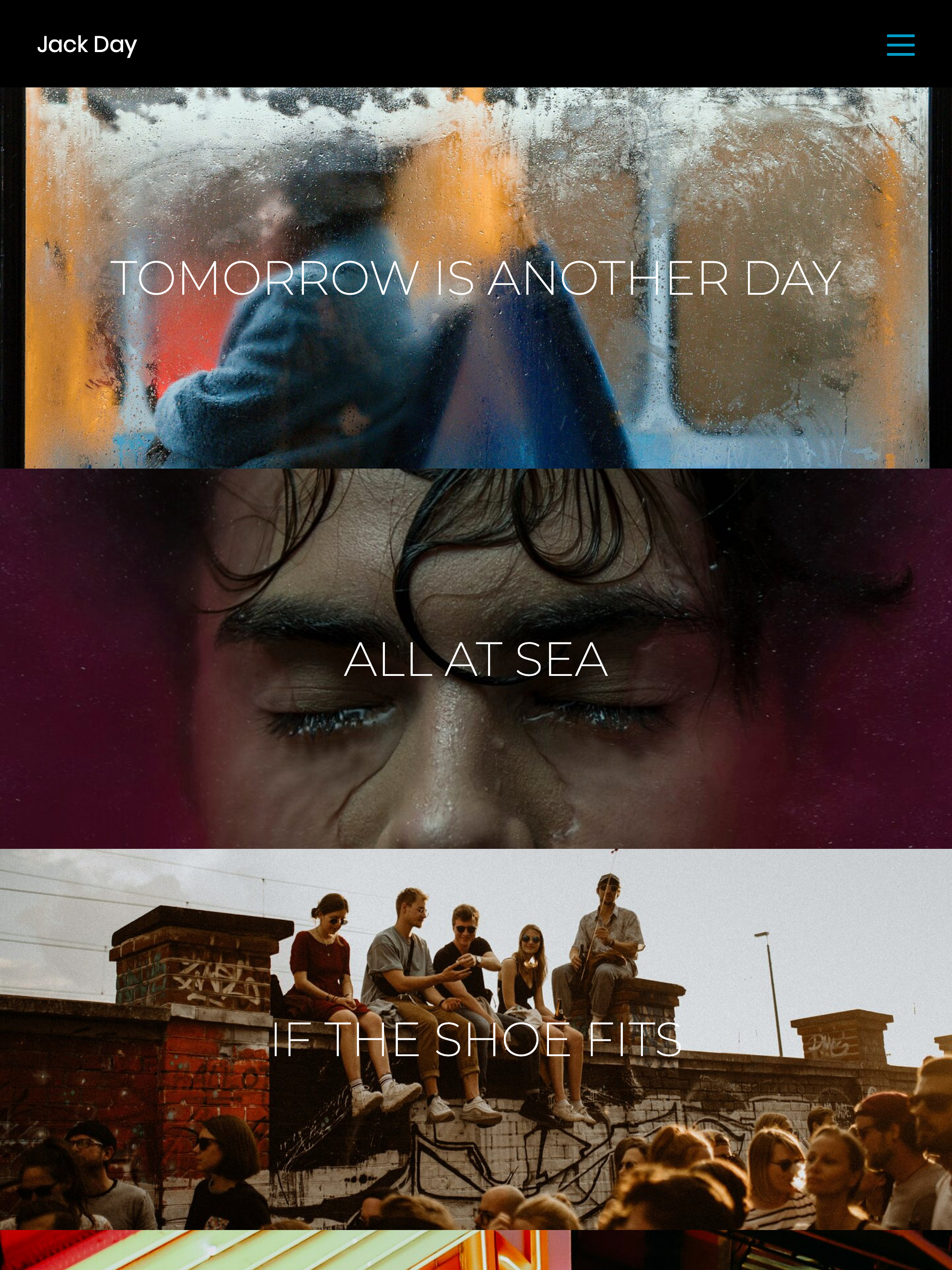
Banner index view with slick dark theme lets the images shine and draws visitors in to find out more.
Street Photography Blog
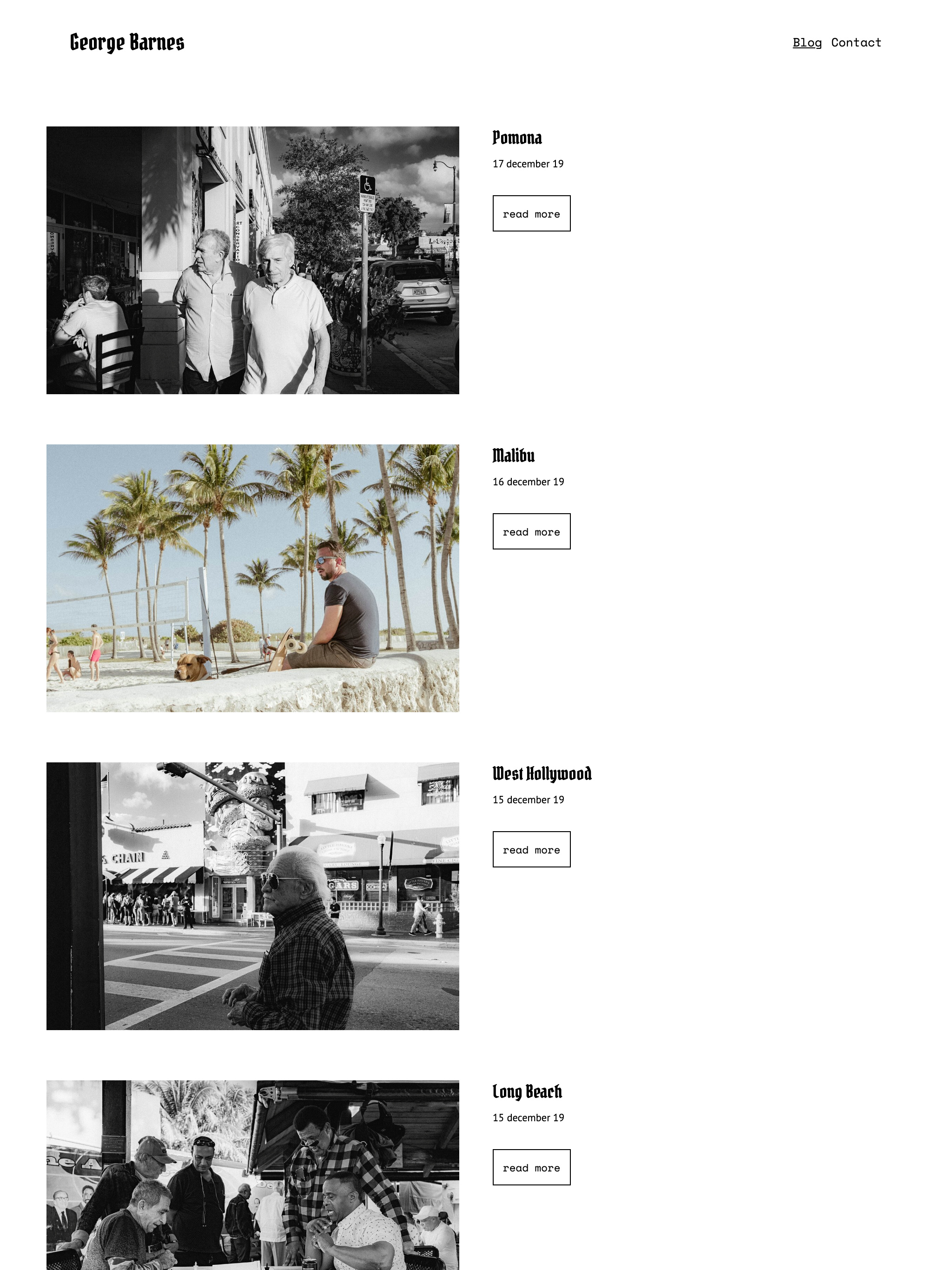
Parallel index layout and Split Top Bar navigation make a simple and modern design with plenty of white space to complement images.
Stylist Blog
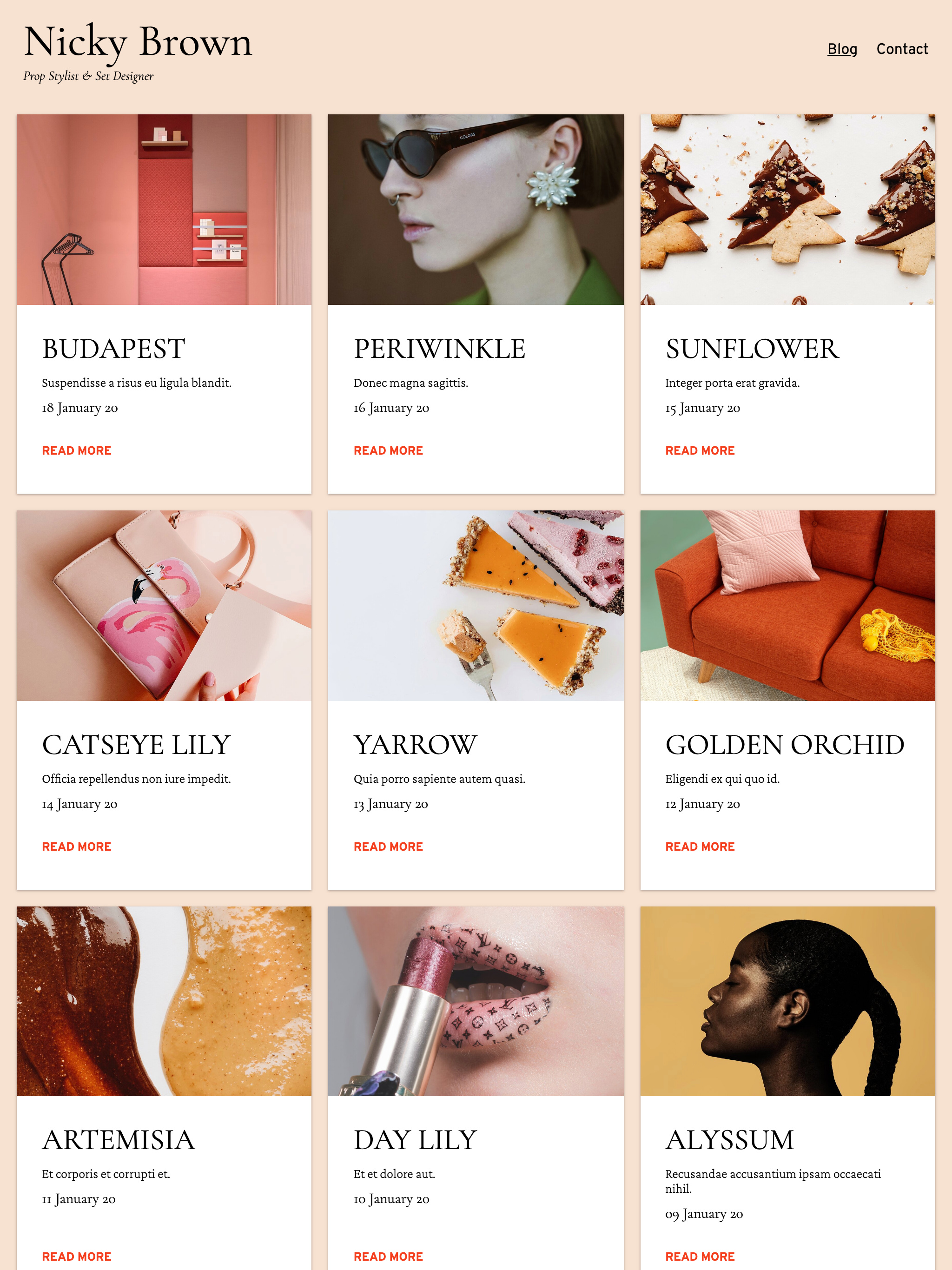
Card index and Split Top Bar make for a stylish layout combo.
Photography Blog
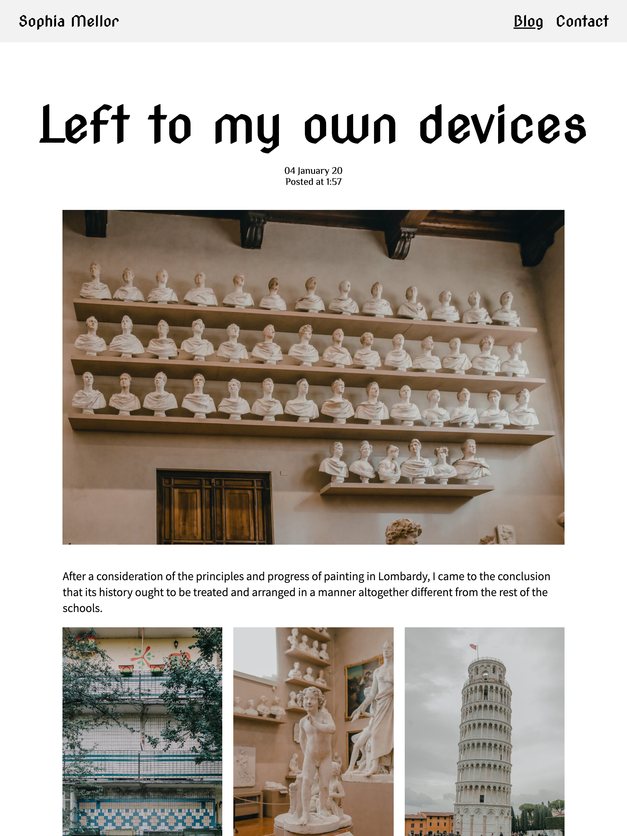
Card view isn't the only option for Series 3 blogs. Classic stream view is a great way to showcase your work. Use post templates to make each post a unique journey.
Puppy Blog
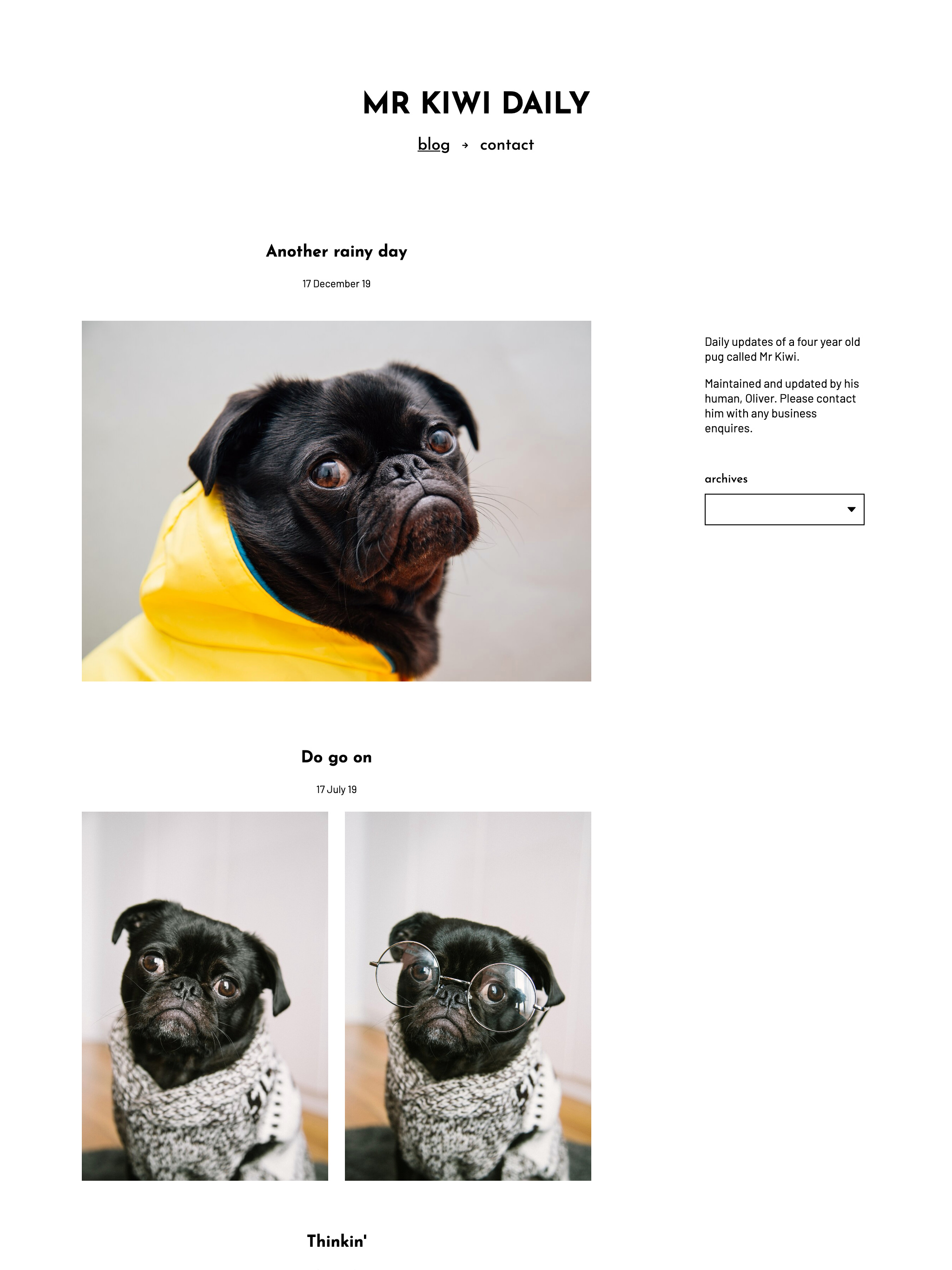
Another blog showing full posts in stream view. Use widgets as a sidebar to add some information to your side-project blog, pug-based or otherwise.